
How to design a CV for shortened attention spans

You know how the typical advice and ‘exclusive’ insight you get about CVs is that they’re only viewed for about 2-3 seconds. I find that notion must be even more difficult with people having even shortened attention spans. At this rate, are they even looking past the first practice listed in your experience section? Does the time and care you’ve put into this piece of page actually hold any weight?
It’s hard to know without truly understanding the larger hiring system, but this varies from practice to practice. Across the 20 or so studios I’ve had some insight into, none use filtering systems or AI screening software to filter through CVs. Perhaps that says something about how slow the industry is to catch up to global hiring processes, or perhaps this slowness works somewhat in our favour to preserve some kind authenticity. Nonetheless, some studios were adamant that an application is viewed by at least one human.
I find this somewhat reassuring and challenging at the same time. Surely, if a medium-sized practice receives somewhere around 200 applications, are all those applications being viewed equally? When does it shift from a hiring exercise to a split second decision, much like swiping right or left? I guess we’ll never really know and the hiring system in architecture or the built environment is so layered and riddled with issues like pay transparency or incorrect usage of protected titles that all graduates can really do is put their best foot forward and hope for the best.
So how do you design and curate a CV for these shortened attention spans? In most industries, a plain, black and white CV is considered the norm. This is likely so that each applicant has the same chance or an employer has a base structure to work with. But in the creative world, I feel like we have a little more freedom with the way our CV is designed and not simply presented. Of course, taste in this regard is also a subjective matter, so there’s no guarantee that even the best designed CVs will land you a job.. After all, the contents matter, right?
Design matters
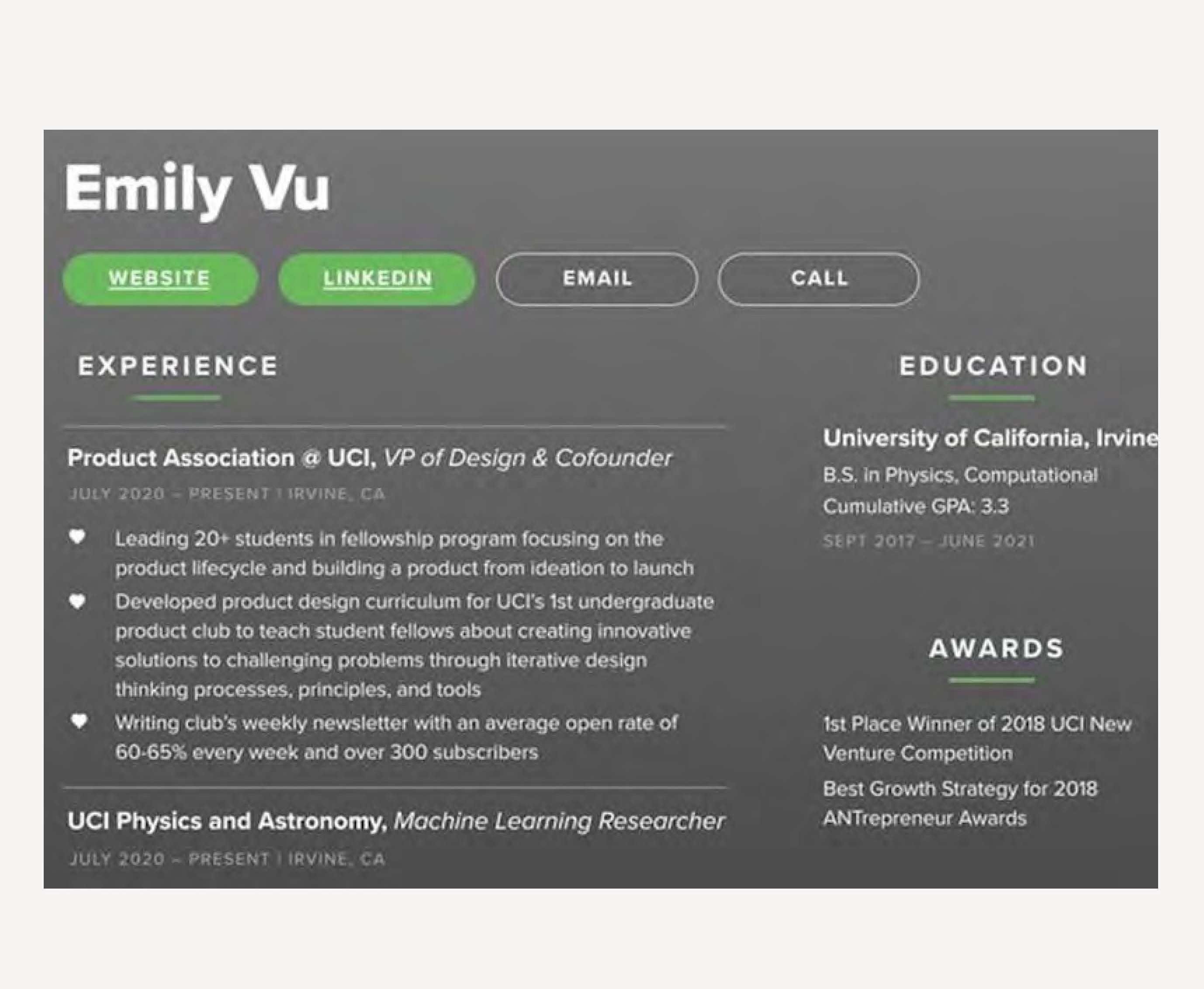
Your CV is a snapshot of your academic and professional background, usually coupled with technical and soft skills in a neat, single A4 page. I’d reccommend not going past the one-page because you often run the risk of practices losing that page altogether, sometimes not even looking past the first page which means any important information goes unnoticed and creating more friction for the hiring manager. There are a number of formats to go with, but this article isn’t about the basic things that people do or don’t do. There’s also no documented feedback of what makes a good, strong CV.
So instead we pivot to design. The design of your CV is something that you can control. It’s the way colours, fonts and other graphics look on the page and to me, it’s how you brand it. A brand is something that is memorable, and your CV should be too. I remember hearing from a practice how they received a large number of portfolios sent in physically (hugely uncommon now) and out of all the CV’s there was a single one in an orange folder. I’m sure you can visualise such a scene. Standing out is the best thing you can do to increase your chances of getting noticed.
Note that I didn’t say, getting hired. As I mentioned, the contents still matter. But how do you do anything unique in a single page? Sure there’s only so much you can do with colours and fonts, but that’s not really the point. A while back a CV someone had designed to apply to Spotify had gone viral and was making the rounds on pretty much every social media platform. The genius behind this was simply adopting their UI to format a CV and show how they are a natural fit for the company. For software or tech, this might make sense, but does it translate to architecture practices?
Why not? If you have a few dream practices on your list, speculative applications can go a long way even if they aren’t hiring. You can use design to your advantage and adopt their branding or colours or outline how their ethos aligns with yours. The only downside to this exercise is time, but if you’re seeking a job in this industry, I’m sure you’ve spent hours and days on end scrolling through job adverts anyway. I once took a presentation of ideas with me to an interview, created in the practice’s brand identity which definitely got noticed and maybe even impressed them a little. This small exercise shows you have that hunger but also a design eye.
Content
Let’s say you manage to overcome the design aspect of a CV and your aesthetically appealing A4 gets looked at by a hiring manager or director. What are the chances they are actually going to read each and every word? A common mistake I see graduates make is formatting text as long, chunky paragraphs. No one reads this way. In fact it’s more jarring to read long lines of text - which is why I assume the LinkedIn format of text posts works so well - breaking each sentence into it’s own line for maximum impact. There you can also play around with sentence lengths for a varied read.
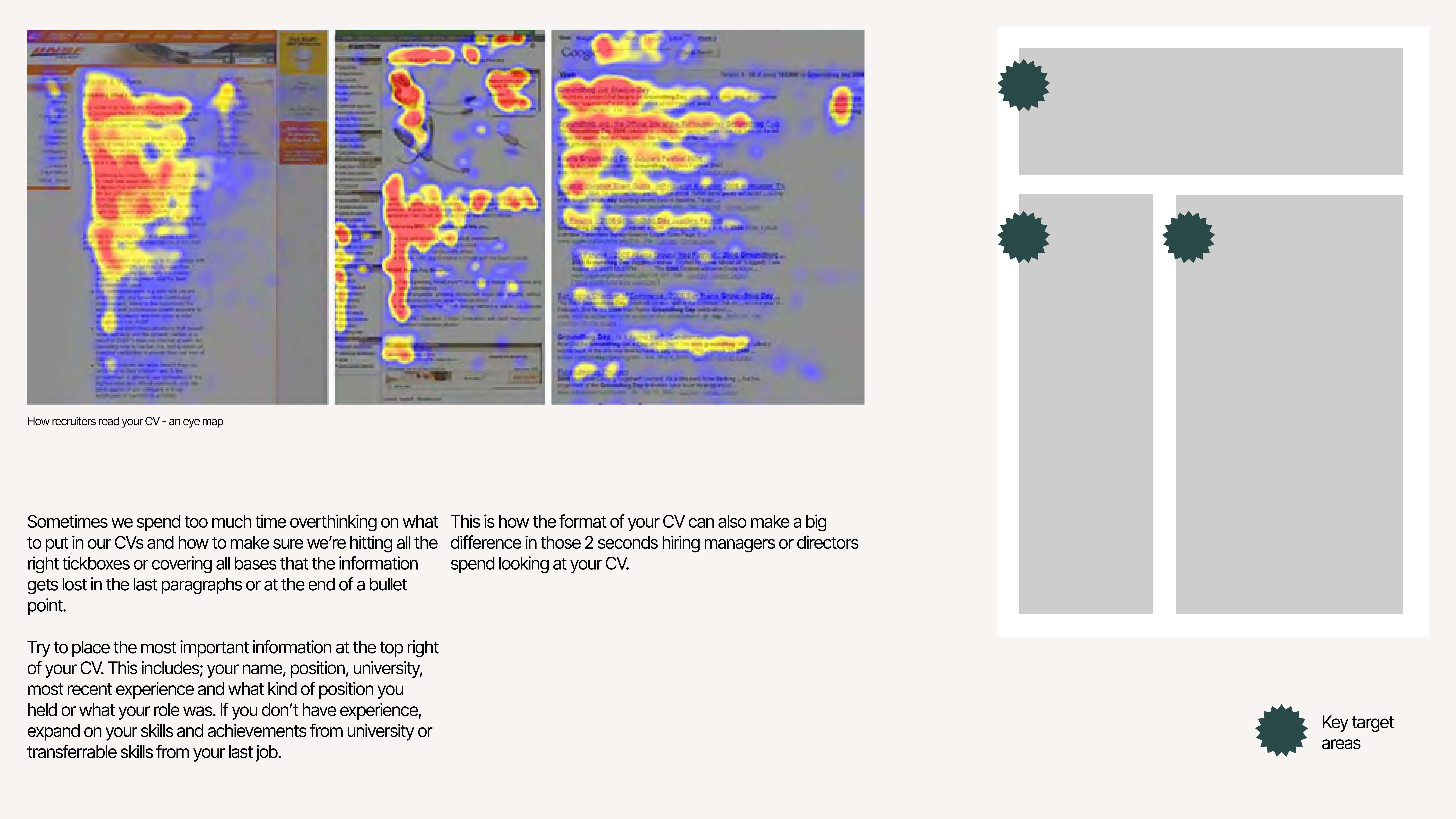
Equally, when hiring managers look at your CV, I’m told they read them in an ‘F’ formation. See the eye maps below that show how one’s eye moves across the first few words of each paragraph and then slowly taper off. A trusted format can work well, but if we apply the idea that by the time someone gets to viewing their 54th CV, their eyes are moving the same, then we should be putting the most important information directly in their view. This often includes information such as your most recent job, how long you were there for, and then perhaps your educational background.
My assumption is that architects aren’t necessarily judging you based on what practice you’ve worked at or what university you attended. They’re actually looking for connections that they can use or reference as talking points. Say you went to Nottingham University, which coincidentally is where that studio takes part in their mentoring programme each year - instant talking point. Or perhaps they contribute to Bath University’s student magazine and you were part of the committee. Remember, architects aren’t just looking for someone who matches their skillset, they’re looking for someone they can see themselves working with every day, so personality matters.
As for the tick-box exercise of skills, if you’re unsure how to connect a non-architecture related work experience with a Part 1 role, start matching up skills from job adverts to real experiences you’ve had. For example, when practices ask for problem-solving skills, you can relate this back to the time you had to re-arrange the retail floor to maximise how much product was out but also account for an efficient route (obviously make sure you’re telling the truth). Print out a few job adverts and start highlighting skills you have and notice the way these are talked about. This will help you to get a sense for how to talk about your own skills as well.
Clarity is essential
Now that we have design and content covered, another aspect that I think might be the most important one of all and touches on the last two topics is clarity. Clarity in design comes from a clutter-free page with ample breathing space. Think about the way your text has hierarchy to show the order of importance in the information presented. Likewise, clarity in content is the way you talk about yourself without waffling on or emphasising how ‘passionate’ you are about architecture.
A director at a practice once explained to an Open Studio attendee that if they can’t get a sense of who this person is, and their basics (education and experience) then it’s am immediate turn-off. Clarity can be the difference between a practice wanting to get to know more about you versus putting your CV in the rejected pile. If it’s not clear from the get-go that you have an international qualification and that you’d need a visa sponsorship, then you might end up wasting their time and yours if the application gets taken forward.
Equally this level of clarity should be paired with your portfolio and cover letter, aspects that I’ll be covering in future posts. The way you talk about yourself can largely influence your confidence, and in turn, the way you are perceived by employers.
Whilst job-seeking has become somewhat of a game of Russian roulette, it can help to know the rules before playing the game and accounting for factors such as the way someone might read information or how to format your CV to be pleasing to the way, can help move the needle in your favour.
